dataset
Large dataset, simple reading
The core improvement is turning a wide, messy source file into an experience that is quick to understand even for a non-specialist audience.
Visual storytelling case
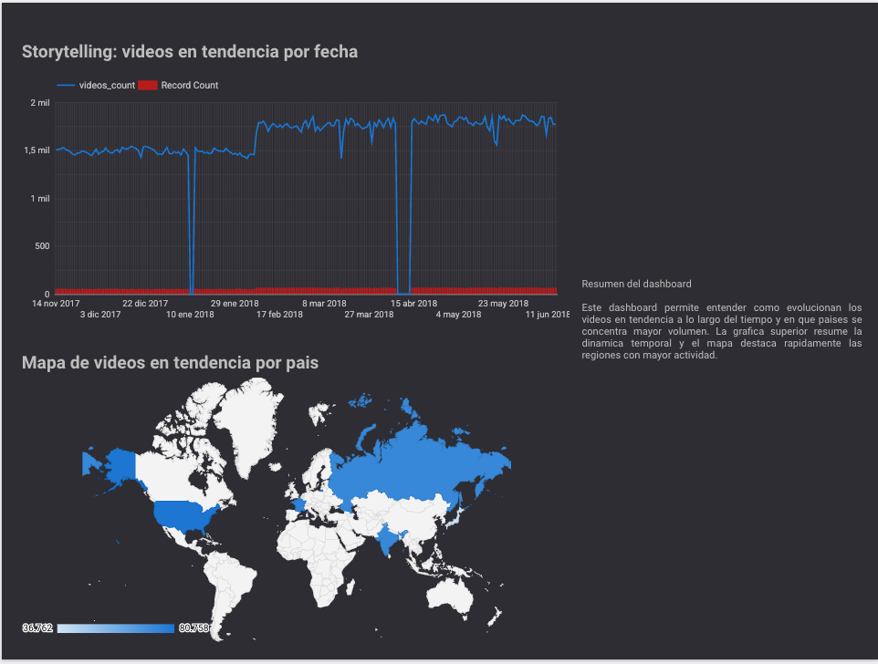
A visual storytelling case built from trending_by_time.csv. The project cleans, structures, and visualizes trending videos by category, region, and date so a large dataset becomes a clear public-facing exploration experience in Looker Studio.
Trending videos
339,990
The dashboard summarizes the total visible volume analyzed across the selected time window.
Categories
18
Side-by-side category comparison makes it easier to spot dominance and publishing patterns.
Time span
7 months
From November 14, 2017 to June 14, 2018, with cross-reading by time and region.
Guiding question
"Which categories dominate the trends, and how do they change by region and time?"
Inputs
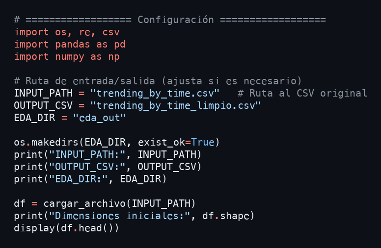
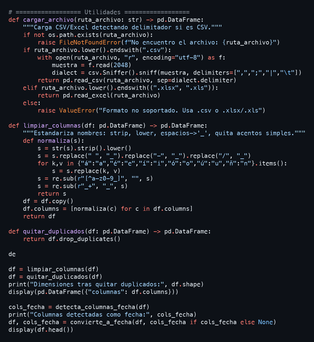
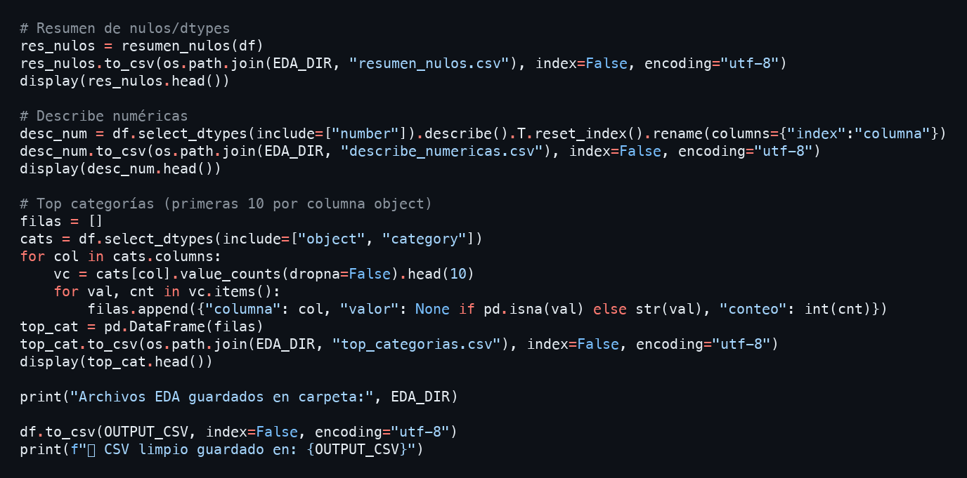
Trending video dataset, Python cleaning notebook, date conversion, and preparation for visual analysis.
Outputs
Public Looker Studio dashboard, support PDF, and an accessible reading flow for non-technical users.
The core improvement is turning a wide, messy source file into an experience that is quick to understand even for a non-specialist audience.
It combines Python data preparation with a public Looker Studio delivery, closing the loop from raw data to navigable visual output.
The case does not stop at chart output. It orders regions, dates, and categories so the dashboard reads like a story rather than a pile of visual noise.
01
Notebook workflow to detect delimiters, normalize columns, remove duplicates, and prepare the base file.
02
Time standardization to support clean comparisons between 2017 and 2018.
03
Quick exploration of nulls, categories, regions, and counts to decide which signals deserved to become visible.
04
A published Looker Studio dashboard with a time series, geographic map, and side explanation card in one guided view.

Real notebook snippets used to load the CSV, clean columns, convert dates, and export the EDA that feeds the dashboard.
Visual dominance
Entertainment
Entertainment clearly appears as the strongest category in the ranking shown by the dashboard.
Time comparison
2017 → 2018
The time series supports a compact reading of how category activity evolves across the visible two-year span.
Regional reading
5 regions
The map gives users a faster regional comparison than raw tables and supports interactive exploration by place.
A reproducible notebook for CSV cleanup, date handling, and basic EDA report generation.
A public visualization that brings KPIs, geography, time, and categories into one readable flow.
A short support document explaining the dashboard goal and its value as an open exploration tool.
It leads the portfolio because it combines data cleanup, visual judgment, and clear communication in a format that is easy to consume. It shows that I do not just analyze data, I can also turn it into an experience other people can use.